As you can see from this snarky yet hilarious rebuke of basic workplace passive aggression, the font you choose matters.
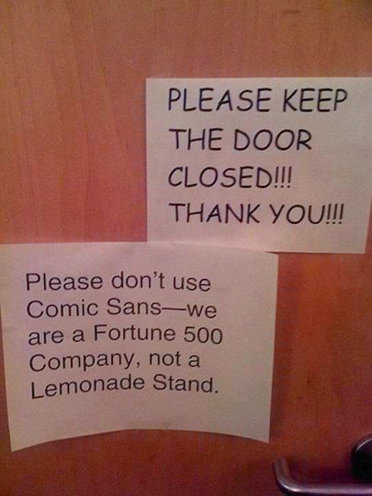
As marketers, we must constantly work to balance the brand, tone, messaging, efficiency, and a hundred other things. Using a set of typefaces that conveys your brand voice across multiple platforms is just one more thing on the list. You definitely don’t want your work to show up here. Below, a quick guide to font-related considerations.
VISUAL HIERARCHY

Make your messaging work harder for you by creating a hierarchy using at least two, preferably three, fonts. This way, your audience can easily identify headlines, subheads, and body copy. In some cases, the same font, in different sizes, weights or colors, can be used to create a visual hierarchy and guide the reader to important information.
LEGIBILITY & READABILITY
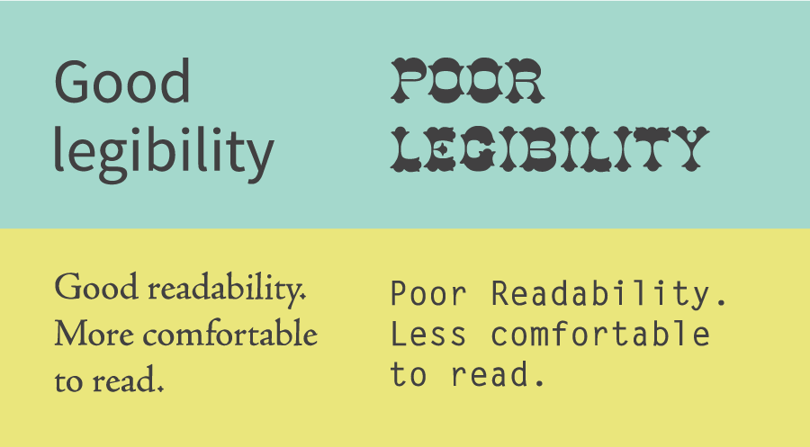
As you choose your fonts for your visual hierarchy, you’ll want to consider legibility and readability.
- Legibility is a measure of how easy it is to distinguish one letter from another in a particular typeface. As a general rule, use a display typeface for headlines and either serif or sans-serif fonts for body copy, depending on your brand style.
- Readability is how easy it is to read words, phrases, blocks of copy such as a book, a web page or an article. To ensure optimal readability, think through font size, line spacing, and even the contrast between the text and the background.
PLATFORM
To successfully convey your message across all channels, be aware of the typographical limitations inherent in email and on the web. Some things to think about:
- Optimize for multiple devices. With the smorgasbord of browsing options available these days, ensuring flexible text size is vital to readability. Whether you employ fluid typography or responsive text, take the necessary steps to make sure your audience can read your message loud and clear across all devices.
- Utilize web fonts (and web-safe fonts as fallbacks) in email. Like most issues in human communication, the messages we send are not always the messages received. Because of the nature of email clients, loading a beautiful font to your computer does not ensure it will be seen by your intended audience. However, the advent of web fonts allows you a little more creativity and aesthetic value than the basic web-safe fonts that come standard on most devices. Just be sure to set a fallback (web-safe) font with similar x-height and kerning, so your design doesn’t suffer if your chosen font won’t display.
What fonts ignite your passion (or make your blood boil)? Let us know!
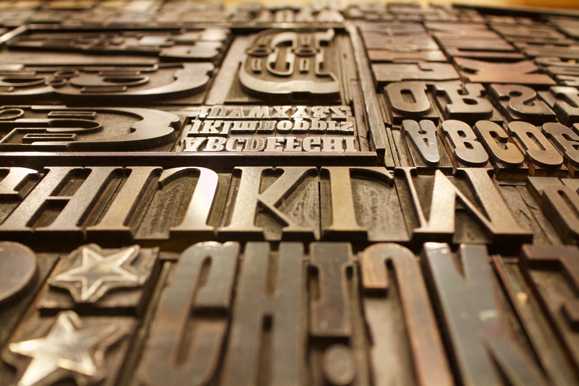
Photo by Marcus dePaula on Unsplash