Browsing Category

Marketing 501

Larger-Look_Listen_POUR_Web_Accessibilty_Blog_Graphics-01
Marketing 501,

POUR Your Heart into Web Accessibility

When building a website, at every stage, you should be asking yourself the question: Is this website accessible for every person? As we explore ways to make your website ADA compliant, we’re going to walk you through the acronym, POUR — the 4 principles central to the Web Content Accessibility Guidelines (WCAG), which is the gold standard for developing accessible websites. Let’s get started!
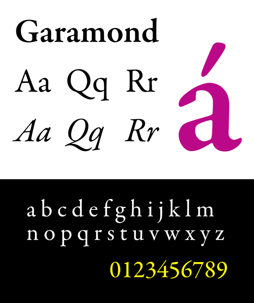
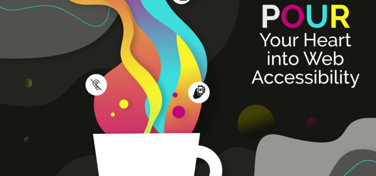
What is POUR?

Perceivable — Can the user see/hear it?

Operable — Can the user get around in it?

Understandable — Is the content easy to follow?

Robust — Is the site compatible across different browsers?

These categories are considered across four major groups of accessibility criteria: not only vision, hearing, and motor skills, but also cognition. Part of accessibility is accommodating for people that deal with temporary or long term impairment to cognitive faculties, learning disorders, and more. When you make your website accessible for all, you make your website for every individual person.

In a survey of web accessibility practitioners, only 52.6% of respondents indicated that their own organization’s web products were accessible in 2021.

WebAIM, Practitioner Survey

Let’s POUR into even more detail…

Keep reading as we break down how to make your website perceivable, operable, understandable, and robust — accompanied with space photos because why not?

Perceivable

Photo by Nasa from UnSplash

When a design is perceivable, it doesn’t exclude any groups lacking any kind of sensory faculty. It can also mean that information is not arranged or buried in a way that would ever confuse or disorient the user.

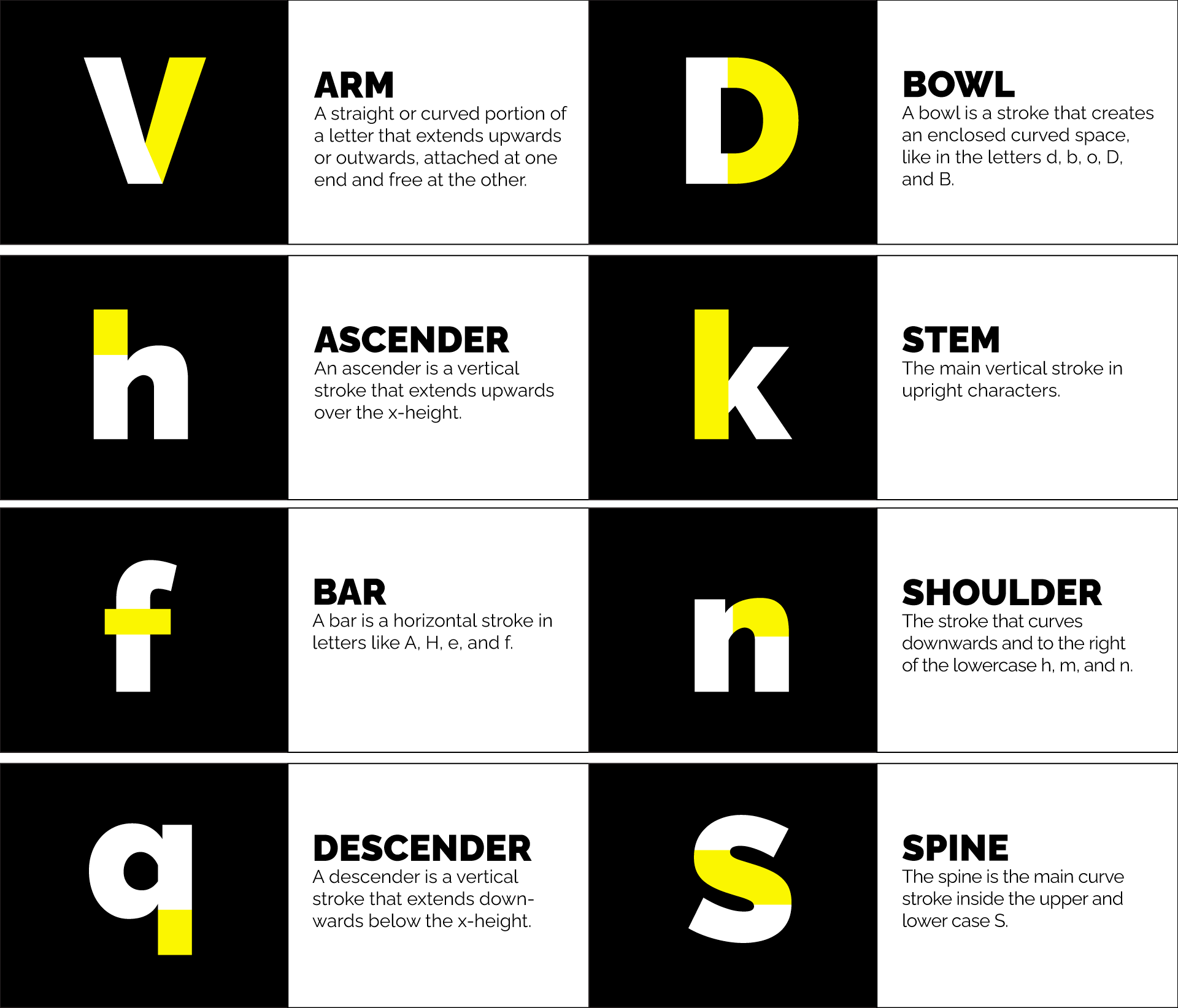
  • Make it visually distinct. There are some questions you can ask yourself as you navigate all the ins and outs of the visuals of your site. For instance, is your website able to accommodate everything from color blindness to total blindness? For important information on your website, using other information aside from just color to convey meaning is also a good way to accommodate those that need visual assistance. And, a great rule of thumb is to always include alt tags or labeling to accommodate for total blindness.
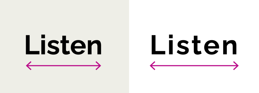
  • Avoid dark patterns. Dark patterns reduce visibility and should be avoided on websites. A method for making your web content visually distinct is to provide enough visual contrast between elements. Say you have a text box with colored text in it on the home page of your website — those colors need to be varying enough so that those with color blindness can see it.
  • Provide edited, quality captions & transcripts for speech. While technology and automation are wonderful, automated closed captioning is unfortunately prone to error. Inputting your own captioning to videos and other media ensures a top-quality user experience for all!

Operable

Photo by Nasa on UnSplash

When a website is operable, it can be accessed in a variety of ways and doesn’t require one single method of inputting or processing information. In the context of websites, this may mean that you can’t rely on the right click of a mouse if the user can’t use a mouse. Speaking of which…

  • You can’t assume the user has a mouse. In order to be accessible and operable for all, accommodating alternative input types on your website is an absolute must! For example, someone may utilize keyboard-only navigation for accommodations in motor function.
  • Always provide second chances. What does this mean for websites? Well, when keeping in mind action items on websites, users should be able to recover from any mistakes they make. For instance, if a user accidentally clicks on a button that takes them to another page within the site, they should be able to easily click back to where they were.

Understandable

Photo by Guillermo Ferla on UnSplash

When a website is understandable, it can be understood by both human beings and, well, robots. Your web content may go through the filter of assistive technology, so it’s important that the material presented makes sense not only to the user but also to the application or tool relating the information to the user.

Jakob’s Law of UX discusses the idea that users spend most of their time on other sites. This means users prefer your site to work the same way as all the other sites that they already know. Designing with patterns the user is already accustomed to is a beneficial practice for accessibility.

  • Use clear and concise language whenever possible. Keep it short and simple! Always ensure links are used in context so that assistive technology can provide the necessary steps for action items on your website.
  • A picture is worth 1,000 words. Use visuals to aid understanding. If an image or graphic provides valuable information (read: not purely decorative), always provide supplemental text nearby and alternative text within the image.
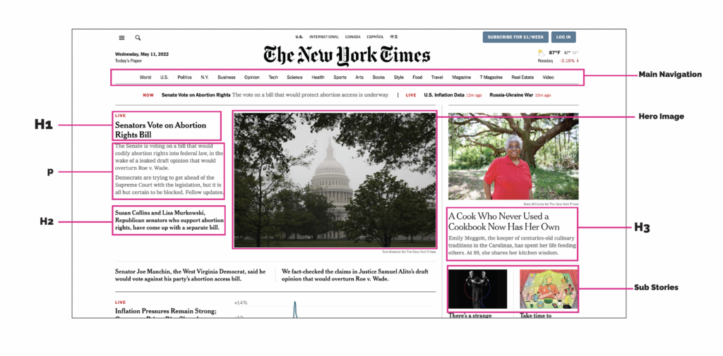
  • Structure, structure, structure! When checking your content for structure, you can ask yourself a lot of different questions. Does it follow a logical order? Is it tagged appropriately? Are the call-to-action buttons making sense? If a text-to-voice assistive technology was reading pages from top to bottom, would the user have a full understanding of the purpose of your website? When you nail down structure, you nail down understanding across your web content.
  • Use Intuitive UI as a basis for the best possible user experience. In other words, and to sum up Jakob’s Law, don’t reinvent the wheel. For example, people are used to landing on a home page and using a menu to take them to other, more detailed pages. They may find your site difficult to use if you go rogue and forego navigation for aesthetic or other reasons. So, absolutely innovate, but design your site in a way that’s familiar to the most possible users.

Robust

Photo by Guillermo Ferla on UnSplash

When a website is robust, it’s capable of dealing with multiple scenarios and situations. A robust site will have been built and tested to be compatible with all kinds of devices, browsers, and operating systems, as well as assistive technologies.

  • Compatibility is key. Does your site function across different browsers and devices? Is your site compatible with slow internet speed, older computers, and less-popular browsers while not being limited to it?
  • Make your site strong, not fragile. Web developers are always innovating — using new technologies to provide cutting-edge experiences for users. Can these technologies be used on your site without breaking or making the experience more complicated?

Is your website ADA compliant?

At Look Listen, all the content we produce is ADA-compliant to ensure a successful digital experience for everyone. Ready to audit your current site or build a site from the ground up? Get connected with us now.

essentials of typography
Marketing 501,

The Essentials of Typography in Marketing

It’s no secret that we experience the world around us through letters and words. I mean, you’re reading and experiencing this blog post right now… through letters and words! Here at Look Listen, we like to think typography is just as important. What’s McDonald’s without its signature logo? So, let’s talk about the essentials of typography. We’ll cover a little history (talking to you, Gutenberg), along with the anatomy, personality, and future of typography as we know it.

A Brief History: Introduction to Typography

In the beginning (a.k.a in 1450), Johannes Gutenberg created the first movable type out of lead alloy that proved to be so effective, it’s still used to this day. For the first time in history, mass production of texts was possible thanks to the Gutenberg Press. This revolutionary invention launched the Printing Evolution.

Fun fact: the first book printed was the Bible. There are only 49 copies still in circulation, and they are subsequently known as the “Gutenberg Bibles.” 

Gutenberg bible stamp

Legibility Reigns 

If you’ve ever seen calligraphy from way back when, you’ll likely agree it’s unarguably beautiful. But, can you read any of it? If you’re like us, the answer is: not well. The first typefaces in Europe were modeled after the ornate style of writing used by scribes. At the time, most people (who could read) were used to reading this beautiful, complicated type. 

Example of ornate, European calligraphy typeface
Credit: Andrei Ermakov via Getty Images

This style of difficult-to-read-but-lovely-to-look-at-writing is now referred to as “Gothic.” A reaction to the Gothic typeface was the Garamond typeface, which was developed in the Renaissance period along with other Roman styles. These styles have thinner curves and serifs, resulting in a cleaner, more legible page. Eventually, these evolved into the serif typesets popular today in Western printings.

Examples of Garamond typeface

We have just one question: Are you a serif person or a sans-serif person?  

The Anatomy of Type: Terms, Classifications, and Properties

The only time you’ll hear us talking anatomy is when it comes to breaking down the body parts of letters. Believe it or not, all letterforms have specific terms used to describe their individual pieces that make up the whole.

From sans-serifs to serifs, they all have legs, arms, ears, shoulders, tails, spines, you name it!

Let’s break down the main pieces of typography you’ll most often hear referenced: 

A table containing examples of letter "body parts" including arm, bowl, ascender, stem, bar, shoulder, descender, and spine

While we’re at it, we’ve put together a cheat sheet of some of the most commonly used terms surrounding the anatomy of type. Check it out: 

X-Height: The x-height isn’t exactly a part, but rather a measurement. It measures the height of all lowercase letters that are part of the same typeface. It’s called x-height because the letter x of each typeface is what determines the measurement.

Cap Height: The cap height is a measurement of all capital letters in the same typeface. The most accurate measurement is found in flat-bottomed characters like the letter E.

Kerning: The space between individual letters. It’s used when you need to move only one letter because it is too far or too close to its companions.

Tracking: The proportional space between all the letters in a body of text. When you change the tracking, it helps fit more letters in a small space or spread out letters if they are too tight.

Example of tracking

Leading: The space between baselines. This means that when we manipulate the leading, we are changing the way a paragraph looks.

Example of leading

We Are Letters and Words: Type as Personality 

Words and letters are in practically everything around us. In our modern culture, people identify brands and products based on their carefully chosen typography. How typography is used and designed can evoke a mixed bag of feelings. It can be sleek and modern, dark and grungy, fun and playful, or old and classic! While a brand logo may not have any typography at all (think the unforgettable Nike swoosh), a wordmark is a text-based logo (think the stunning Coca-Cola red cursive letters).

What are some of your favorite brand wordmarks (other than the Look Listen wordmark, of course)?

Pretty much anyone in the world can recognize these iconic golden arches immediately!

The Future Of Type: Considering New Standards

As a marketing agency, Look Listen is no stranger to the ever-evolving, ever-changing landscape of our industry. We never want to stop learning, and we know standards and practices change in an instant. So, what are some current best practices for typography in relation to digital marketing? 

Best practices around web text often differ from printed text, and there’s a lot more to account for when it comes to rules around the web. Digital typography needs to…

  • Capture shorter attention spans
  • Remain readable
  • Adhere to accessibility standards
  • Stay compatible across multiple digital devices (from your big ole computer monitor to your small phone) 

Let’s talk typography hierarchy (say that five times fast) for web pages. Most web pages, especially text-heavy ones, break content into sections by topic. These sections are signified and labeled by headings. The order of text, from most prominent to least prominent, comprises the hierarchy of the page. Hierarchy is crucial for making pages easily navigable and digestible. Readers should be able to jump to whichever section is relevant to them by looking at headings alone. You can see this example that we broke down on the New York Times home page. 

How do you standardize text fonts? With so much information out there, is there a way to know? A common practice is to set all website text to a minimum and maximum size. You can (and should) increase and vary the size of your text to further assist readers and establish hierarchy, but don’t go overboard with massive fonts either!

Want to know our recommended font sizes for body copy? We’ve got you: 

Mobile font size: 12-16
Tablet font size: 15-19
Desktop font size: 16-20

Final Tip: If you are a brand or a company, find a font you will use across all integrated marketing. Along with your company font, design a logo that will resonate with your audience and leave a lasting impact. Typography is powerful!

We’re Here to Help

To ensure you’re using typography efficiently to propel your brand, contact us to get the conversation started.


Resources & Further Reading:

Thinking with Type – Ellen Lupton 

The Visual History of Type – Paul McNeil

The Anatomy of Type – Stephen Coles

On Web Typography – Jason Santa Maria

The Responsive Website Font Size Guidelines

Designing for Readability – A Guide to Web Typography

The Beginner’s Guide to Typography in Web Design

The Ultimate List of Web-Safe HTML and CSS Fonts

Look Listen Logo
Marketing 501,

A Visit to LogoLand: Behind the Scenes of a Brand Mark Refresh

As creatives, we’re constantly scrutinizing our own work for opportunities to improve upon it, especially when there’s some daylight between then and now. Recently, we took a good hard look at our logo and decided — though it has served us well — the time was right for an upgrade. We wanted the new mark to hold on to the brand equity of the original while encapsulating the refinement and sophistication that’s been the result of our company’s growth. Our design team went deep into the data, and we’re incredibly proud of the result. But before we get ahead of ourselves, let’s take a look at the work.

Neon sign that reads: Click & Collect
Marketing 501,

Get the Clicks: Do’s & Don’ts of Effective CTAs

Americans, on average, are exposed to roughly 4,000 to 10,000 advertisements per day. Yes, you read that right. In the age of information overload, good content marketing is rendered ineffective without a strong call to action (CTA). It’s important to capture your audience’s attention from the moment they lay eyes on your advertisement or email — but it’s even more important to inspire them to take action.

White chair in a black room
Marketing 501,

Do This, Not That: Stakeholder Interviews

There’s a lot that goes into the successful kickoff of a new project. Before the planning, however, comes the research. And while auditing documents and reviewing assets are crucial components of good research, stakeholder interviews are the gel that brings everything together. Below, some do’s and don’ts to guide your stakeholder interviews, research, planning and eventual project success.