
So you’re building a website or creating an email. That’s great! Now, let’s make sure you’re thinking about accessibility.
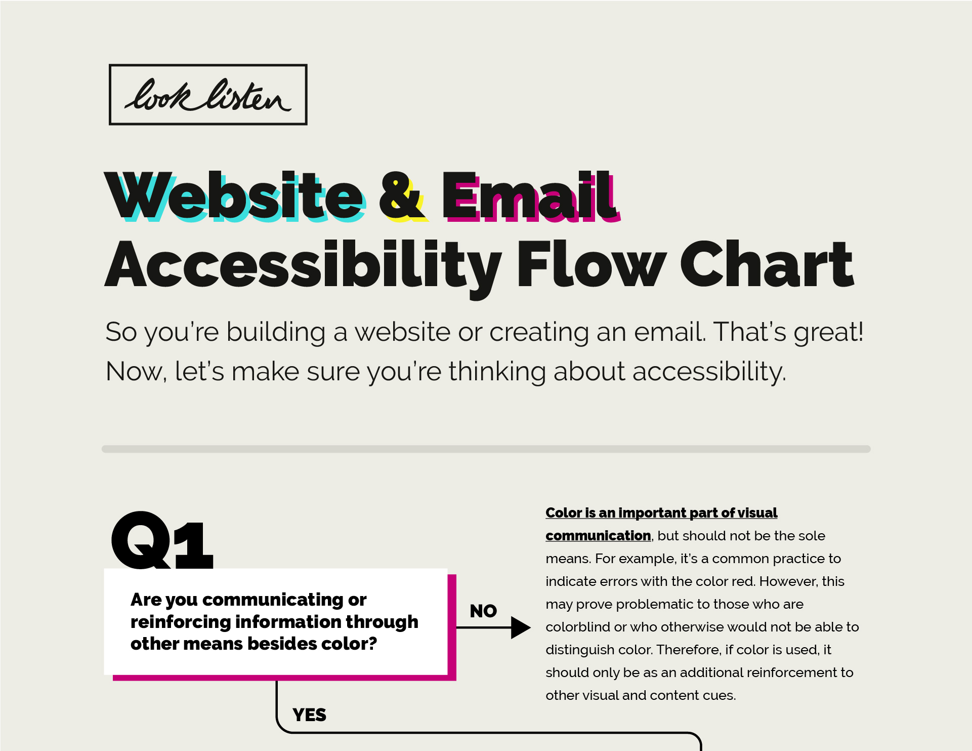
1. Are you communicating or reinforcing information through other means besides color?
YES → FAIL NO → Question 2
Color is an important part of visual communication, but should not be the sole means. For example, it’s a common practice to indicate errors with the color red. However, this may prove problematic to those who are colorblind or who otherwise would not be able to distinguish color. Therefore, if color is used, it should only be as an additional reinforcement to other visual and content cues.
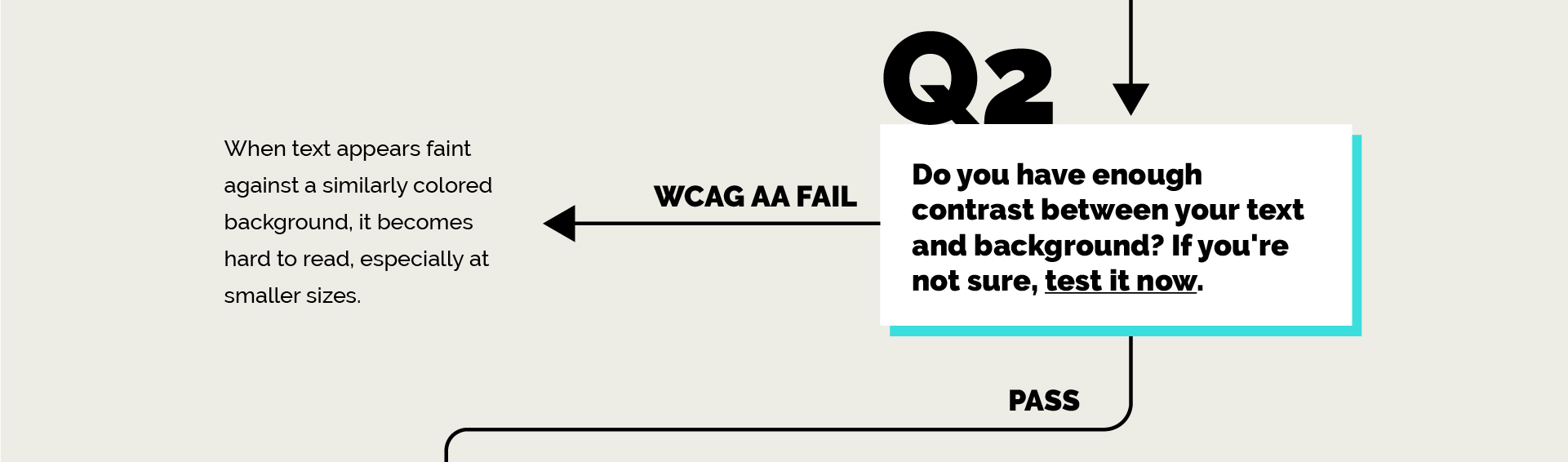
2. Do you have enough contrast between your text and background? If you’re not sure, test it now.
WCAG AA FAIL → FAIL PASS → Question 3
When text appears faint against a similarly colored background, it becomes hard to read, especially at smaller sizes.
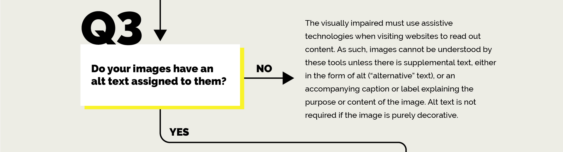
3. Do your images have an alt text assigned to them?
NO → FAIL YES → Question 4
The visually impaired must use assistive technologies when visiting websites to read out content. As such, images cannot be understood by these tools unless there is supplemental text either in the form of alt (“alternative” text), or an accompanying caption or label explaining the purpose or content of the image. Alt text is not required if the image is purely decorative.
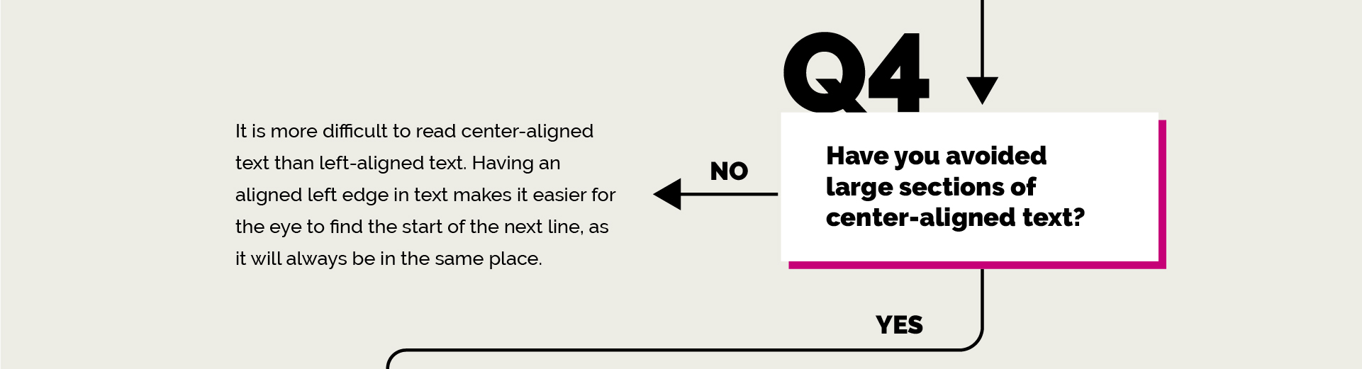
4. Have you avoided large sections of center-aligned text?
NO → FAIL YES → Question 5
It is more difficult to read center-aligned text than left-aligned text. Having an aligned left edge in text makes it easier for the eye to find the start of the next line, as it will always be in the same place.
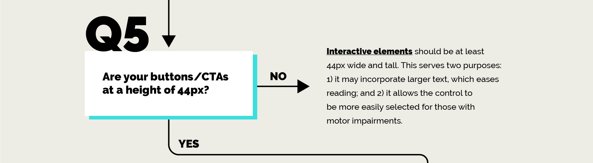
5. Are your buttons/CTAs at a height of 44px?
NO → FAIL YES → Question 6
Interactive elements should be at least 44px wide and tall. This serves two purposes: 1.) it may incorporate larger text, which eases reading; and 2.) it allows the control to be more easily selected for those with motor impairments.
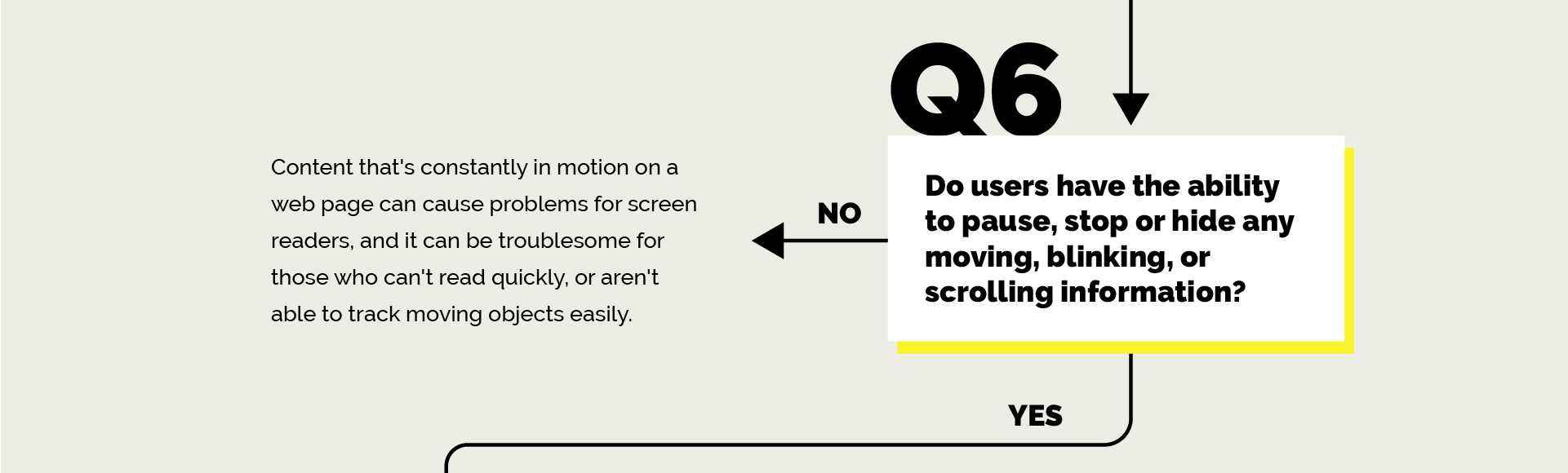
6. Do users have the ability to pause, stop, or hide any moving, blinking, or scrolling information?
YES → FAIL NO → Question 7
Content that’s constantly in motion on a web page can cause problems for screen readers, and it can be troublesome for those who can’t read quickly, or aren’t able to track moving objects easily.
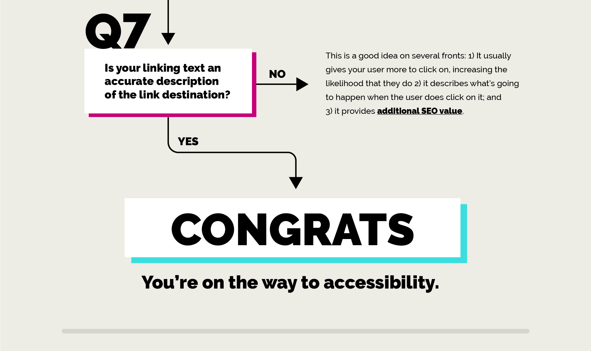
7. Is your linking text an accurate description of the link destination?
NO → FAIL YES → CONGRATS, you’re on the way to accessibility.
This is a good idea on several fronts: 1.) It usually gives your user more to click on, increasing the likelihood that they do 2.) it describes what’s going to happen when the user does click on it; and 3.) it provides additional SEO value.
If you answered “no” to any of these seven questions, don’t worry because ADA compliance isn’t far off.
To ensure you’re designing with all users in mind, simply shoot us an email, include your site’s URL, and we’ll quickly turn around a detailed report with guidance for getting compliant.
Feature image by Tim Johnson on Unsplash