
Surfing the internet in the late ’90s and early ’00s took patience. Internet connection speeds were slow, user experience was an afterthought, and web page designs looked a lot like the Space Jam movie page still looks. [Update: it’s the end of an era.] And over in the marketing world, online advertising was on the rise.
Fast forward to today. Internet ads are the primary driver of website revenue. In his now-famous 2014 lecture, influential programmer Maciej Cegłowski eloquently explained (and lamented) how the advertising model became the default internet business model.
“Advertising is like the flu,” Cegłowski said. “If it’s not constantly changing, people develop immunity.” He continued, “to make it work … companies have to constantly find ways to make advertising more invasive and ubiquitous.”
A POP-UP AD IS BORN
In the 2014 essay, “The Internet’s Original Sin,” pop-up ad inventor Ethan Zuckerberg (no relation, we think) explained how he came to write the code for the first pop-up ad (and apologized to the world for doing so):
“At the end of the day, the business model that got us funded was advertising,” he wrote. “The model that got us acquired was analyzing users’ personal homepages so we could better target ads to them. Along the way, we ended up creating one of the most hated tools in the advertiser’s toolkit: the pop-up ad.”
If you spent time on the internet before 2004 — the year Internet Explorer became the last major browser to add a pop-up blocker — you probably remember feeling powerless to, or infuriated by, excessive pop-ups. Before ad blockers, users had no choice but to watch their screens fill up with forced ad windows as they waited for pages to load.
THE (NON-)EVOLUTION OF POP-UPS
Since then, pop-ups haven’t changed much. These days, they’re less pervasive, and they usually contain content that’s somewhat relevant to the user. But they’re still just as disruptive.
For example, say you decide to visit McDonalds.com for the first time. Seconds after you arrive at the homepage, this pops up:
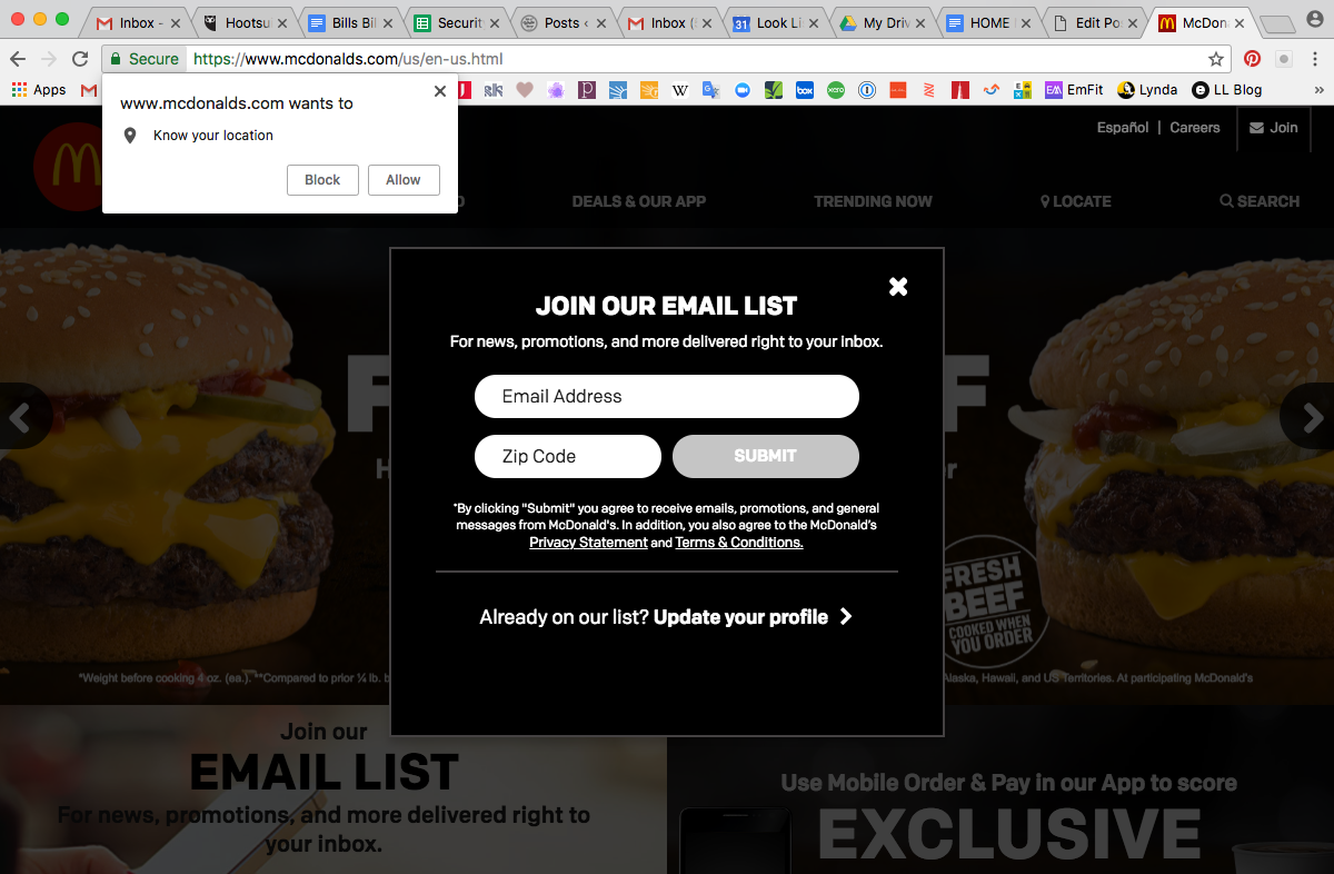
I haven’t even navigated your page yet, McDonald’s, and you’re already asking for my location and for me to sign up for an unknown amount of emails? It’s just too much too soon, and as a user, I resent the intrusion.
By contrast, look at what pops up within seconds of visiting EmilyMcDowell.com.
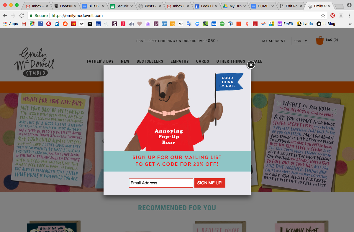
Technically, it’s the same, right? Nope. While the website action is the same, and there’s even less legal copy than McDonald’s, the compelling yet straightforward call to action is arguably a better use of time. Could it appear on the second click or further down the page? Yes. But the Annoying Pop-Up Bear is right: At least he’s cute.
DOWN WITH DISRUPTION
To be fair, telling McDonald’s my location would allow me to see the local menu and coupons available nearby. But the legal disclaimers don’t tell me how often I might be emailed or what type of content I’m going to receive. I know from experience to be wary of handing over my email address without any mentions of frequency or relevancy.
Companies understandably want to know if and where a visitor fits into their funnel right away. But almost-immediate pop-ups disrupt the user’s experience and leave a bad taste in most people’s mouths. The best-case scenario is that I’ll truly appreciate the access to exclusive deals. The worst-case scenario is I swear off that brand forever based upon this intrusion.
Four Ways Digital Marketers can Make Interactions Less Disruptive:
- Be patient — Just. Wait. Don’t pick the first page I visit to pop up on me, especially not within the first 10 seconds. Have some patience, and let me get absorbed by your awesome website first. Then ask me if I want to sign up.
- Be entertaining — Emily McDowell Studio is a humor-centered brand that makes greeting cards and gifts. Dubbing their email sign-up mascot the “Annoying Pop-Up Bear” works well for their brand voice, but it also demonstrates a cheeky self-awareness about how awful disruptive content can be. Humor doesn’t work for every brand, but honesty and relevance are a killer combo every time.
- Offer specifics and be trustworthy — Tell me exactly what you want from me, don’t lie to me, and do what you say you’re going to do. Disclose your intentions and any relevant details. Also, please protect my privacy and refrain from selling my email address to a third party. And if I decide to sign up for your mailing list, be cool. Send me a nice welcome email, give me discounts, and don’t pester.
- Don’t be redundant — You can’t ignore a prospect forever just because they ignored your first attempt, but try using a different approach the second time around, such as fresh copy or a new offer instead.
Now, get out there, marketing friends, and be less disruptive!